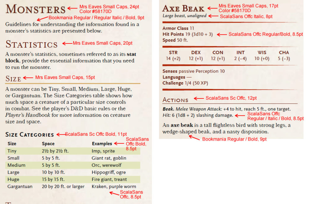


The Fonts of D&D 5th Edition
Since I posted this on Twitter, I thought I would expand on it.
As a publisher, one of the things I always have to keep in mind is that my product's design and layout should be reasonably close to the official products while being very clear that it's not actually an official product. Although my data layout is fairly similar, I have ultimately chosen a different set of fonts and whatnot so that I have my own unique look... but there are still a lot of people out there that want whatever they do to look like D&D in terms of layout.
So I took the D&D Basic Rules free PDF, opened it up inside of Adobe Acrobat X Pro (part of the Adobe CS6 Master Suite), and looked at what fonts and colors they used. And this is the result...
 All these fonts aren't exactly cheap, it seems. At first I thought they were free because I had them already, and I'm not exactly sure why I do but I do have upwards of 6,000 fonts on my system (they come with the job) after all... I have one of my many clients to thank I suppose. If you don't have a client to thank, going out and buying these will cost you like a grand total.
If you look around you can find some pretty close alternatives. For example, this font has been suggested (through the WotC forum thread here) as a stand-in for Bookmania. And ufonts has a wide assortment of ScalaSans fonts although they don't explicitly have ScalaScans Offc or ScalsSans Sc Offc.
So, although this information is here, I have to put a disclaimer: it is not the best of ideas to make your product look exactly like WotC's... Arguably, that's one of the reasons I got a C&D from them in the first place. You simply can't pretend to be an official product by making yourself look like an official product throughout. So you might be OK using this style for fan created, free content... but please do not use these fonts and colors for a retail product. OK?


